Projects
5 projects for this class comprise 45% of the semester grade:
- Project 1 -- Info architecture and organization (5%)
- Project 2 -- Teaching page* (6%)
- Project 3 -- Site brief and sketches for
your website project (6%)
- Project 4 -- Annotated bibliography * (9%)
- Project 5 -- Website or Client project * (16%)
- Graphics Grade -- Your handling of graphics on
at least one of the *-marked projects (3%)
Graphics grade
The graphics grade is not a separate "project", but is one piece (how
you handle graphics) of the projects that you're already handing in.
Instead of getting a separate graphics grade for each project, your
final graphics grade represents the best work that you do on
any of the three projects that involve more graphics work.
In addition to the notes below, see our page on Photo
editing with Photoshop.
Here are the criteria for the appropriate use of graphics:
- Display size should complement other visual design elements on the page.
 Example: This diagram
is too big for it's column width resulting in an awkward, too-thin band
of text to the right of the image -- a problem which could alternatively be
solved by going with a wider column width.
Example: This diagram
is too big for it's column width resulting in an awkward, too-thin band
of text to the right of the image -- a problem which could alternatively be
solved by going with a wider column width.
- Do not squeeze or stretch images away from their
original proportions. Use Photoshop to re-size images: it's easy to preserve
the original proportions of height and width.
 Example: Screenshot of skinhead pix site where a
long and skinny photo was re-sized to a square.
Example: Screenshot of skinhead pix site where a
long and skinny photo was re-sized to a square.
- Don't use <img height=... width=...> to
display an image at anything other than it's actual size. Resize
images in Photoshop rather than in HTML.
When the browser (instead of Photoshop) shrinks an image, you
are transmitting an unnecessarily large image across the net, and you're
missing out on the chance to sharpen your downsized image.
 Example:
Earlham Anime Club (right-click
and "View Image" to display an image
at "actual size"). See also this photo
page at geocities which
both re-sizes and distorts with image attributes.
Example:
Earlham Anime Club (right-click
and "View Image" to display an image
at "actual size"). See also this photo
page at geocities which
both re-sizes and distorts with image attributes.
When the browser expands a small image to larger display sizes, image
quality suffers:
But,
Ashley's
project shows one exception, where a smaller image is blown up for
use as a background image--in this case the detail is not really important,
so why not do it this way to conserve bandwidth?
- Use the alt attribute of
the image tag to
say what an image is all about. This is a particularly important guideline
for handicapped accessibility, and is required for your document to validate
as HTML Strict.
 Example: NYTimes
image of Senator Ted Stevens.
Example: NYTimes
image of Senator Ted Stevens.
- Be careful of haloes around anti-aliased images (particularly text)
that you've made partially transparent.
- Make sure both text and links are legible on top of the background image
you set.
 Example: Gaming
help site.
Example: Gaming
help site.
- Size graphics to relate visually to other graphics: Two or more images set
beside each other should usually have the same height (width doesn't matter).
Two or more images in a column should all have the same width.
 Example: Way
Architects screenshot.
Example: Way
Architects screenshot.
- When reducing the size of an image, or creating a thumbnail as a link to
a larger version of the image, instead of just making the whole image smaller,
consider cropping to just one detail in addition to reducing size.
Example: "La Nacion" graphic:

<img src="ban-nacion.gif"> |
Original banner graphic. File size: 11 KB.
Original image dimensions: 346 x 94 pixels. |
<img
src="ban-nacion.gif" width="200" height="80"> |
Don't do this: Re-scaled, and distorted in HTML. File size:
still 11 KB |

<img src="small-ban-nacion.gif"
width="107" height="30" alt="La Nacion
-- Costa Rican daily newspaper"> |
Better for a smaller image: Cropped closer to the text, then
down-sized in Photoshop, while maintaining original height-to-width proportions
File size: 1
KB. Image size is 107 x 30. |
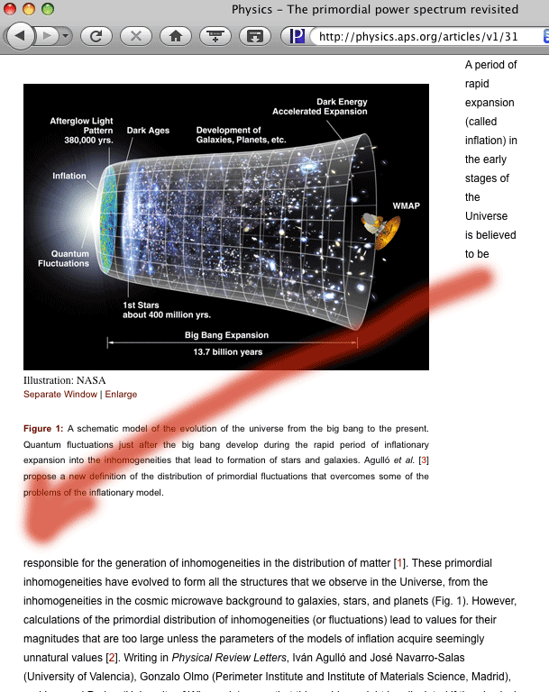 Example: This diagram
is too big for it's column width resulting in an awkward, too-thin band
of text to the right of the image -- a problem which could alternatively be
solved by going with a wider column width.
Example: This diagram
is too big for it's column width resulting in an awkward, too-thin band
of text to the right of the image -- a problem which could alternatively be
solved by going with a wider column width.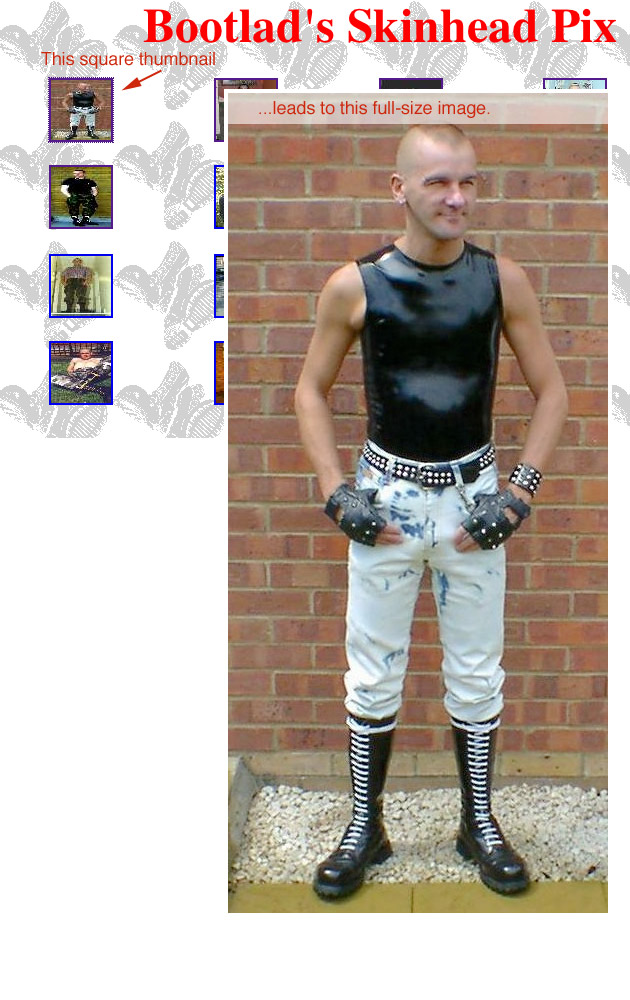 Example: Screenshot of skinhead pix site where a
long and skinny photo was re-sized to a square.
Example: Screenshot of skinhead pix site where a
long and skinny photo was re-sized to a square.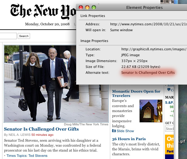 Example: NYTimes
image of Senator Ted Stevens.
Example: NYTimes
image of Senator Ted Stevens.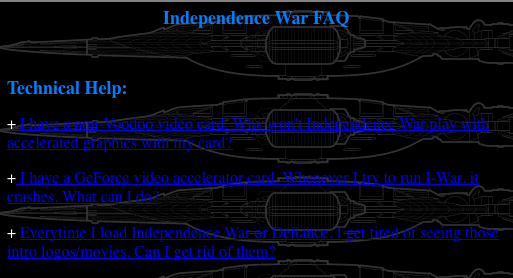 Example: Gaming
help site.
Example: Gaming
help site. Example: Way
Architects screenshot.
Example: Way
Architects screenshot.