 Little
boxes are very useful for grouping similar items together.
Little
boxes are very useful for grouping similar items together. Little
boxes are very useful for grouping similar items together.
..whether it shows or not.
Using Firebug we can turn them all on:
* {border: 1px solid red;}
 But, not only the tags we know so far have boxes. Most pages look like there's
some higher level of grouping going on.
But, not only the tags we know so far have boxes. Most pages look like there's
some higher level of grouping going on.
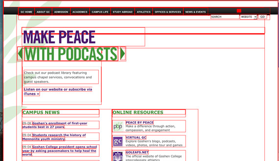
Sometimes you can easily see at a glance where there are boxes being used to group content:
 Though one level above the boxes you can easily see might be another level:
Sometimes it's less obvious where the boxes are that are organizing the content:

It helps to focus on the type and not the graphics...


[Hicks Design]
We'll return later to more on the CSS Box Model.
Here's a recurring pattern that many sites use,

That we might sketch as...

But outside of this is yet one more level...

A lot of sites pour all their content into one such container. (Though you might also have a few different containers stacked above each other--see cnn.com.)
There are two dominant approaches to this design problem...
For both of these approaches, we'll enclose all of our markup in a container
layer: the <div> tagset that looks like this ...
<body>
<div id='content'>
[all our page content...]
</div>
</body>
</html>
Here we'll go through the process of constructing the container step by step.
#content {
  width: 600px;
}
That's it! We don't want a height if we're going to fill this container with text and other things.
#content {
  width: 600px;
  height: 300px;
  position:relative;
}
This kind of a container lets us position a bunch of items using absolute-positioning, and then move them somewhere else on the screen as a group.
In DreamWeaver, this kind of container allows us to drag around our layers with the mouse, and position those layers relative to our container (not the browser window).
The height is only needed if we want to position layers relative to the bottom of our container box on the screen.
The full story on the position property is...
#content {
  width: 600px;
  margin: auto;
}
With FireFox, this is enough to produce a centered container with a fixed width. See for example bluerobot.com. But, this doesn't center in IE. We can cause the container layer to be centered with this additional body rule...
body { text-align: center; }

#content {
  width: 600px;
  margin: auto;
}
But--oh no!--Now text inside the container is centered as well. So, our final iteration which results in
body { text-align: center; }
#content {
  width: 600px;
  margin: auto;

  position: relative;
  text-align: left;
}
#content {
  width: 80%;
  margin: auto;
}
This is the simplest way to make a container with a variable width. The container will always be 80% of the width of the browser window, whether that window is set to be 100 pixels wide or 1400 pixels wide.
Since the <table> tag, it's been possible to make flexible layouts with
a minimum width, but no maximum width.
IE7.0 (but not IE 6) finally supports the CSS2 max-width property--but
only in 'strict' mode, e.g. using this doctype
<!DOCTYPE HTML PUBLIC "-//W3C//DTD HTML 4.01//EN"
"http://www.w3.org/TR/html4/strict.dtd">
So for the first time, the dominant browser allows us to create flexible layouts
that have both a min and max width.
Unfortunately IE 6 (still the IE flavor installed on more desktops than any other browser) does not understand max-width, and if we set it, IE 6 will act as if no width has been specified, and the division will take up the whole width of the screen!
The solution is to use min- and max-width that Opera/Firefox/IE7.0 will understand,
and use a hack to apply
a rule only to IE6. that will cause IE to display a fixed-width layer.This
will probably be worth doing through at least the end of 2008.
#content {
  min-width: 20em;
  max-width: 30em;
  _width: 25em; /* only affects IE 6 and below */
}
Another promising approach is the use Dean
Edwards' IE7 javascript library which promises (and mostly delivers)
to make IE5.5-6.x act as if they're obeying current CSS standards. I'm
finding (2008) that it supports, e.g. min- and max-width when specified
in pixels, but not in em units.