A redesigned Goshen.edu
Spring 2017 Update
Over the past few months we’ve been quietly rolling out a new Wordpress theme, first on Academics, now on the homepage, with many more sites to follow.
Content
Some highlights from the homepage:
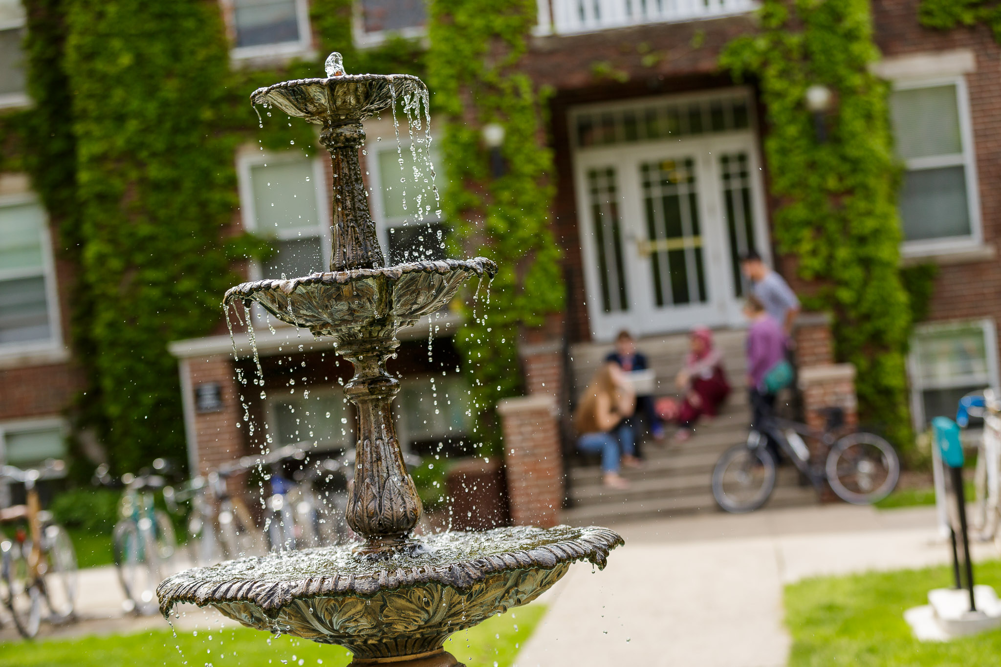
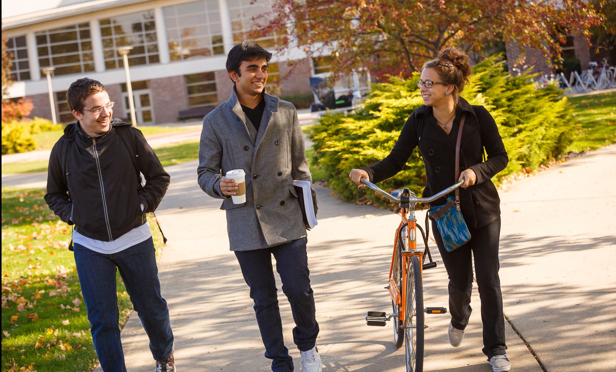
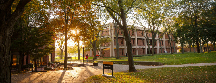
- great videos of campus (produced by FiveCore Media) featured prominently, giving a strong sense of place
- a clear first call to action driving students to check out our programs of study
- top level messaging about our academic excellence, affordability and great outcomes
- incorporation of featured news and events on the homepage
- incorporation of recent images from the GC Instagram account
- a new footer that highlights where we are located
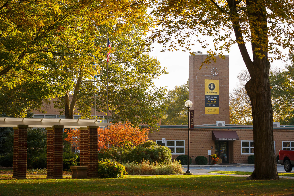
- and still some very cute squirrels helping showcase what’s distinctive about this great place!
Technical
And from a technical perspective, this theme is a ground-up rewrite of our 2014 responsive redesign focused on performance, accessibility, and mobile-first design.
Performance
The new theme was built to optimize the browser’s critical path with the goal of improving perceived performance. Technical achievements include:
- Breaking up our stylesheets into critical (above the fold) and non-critical CSS, inlining the first and loading the second asynchronously.
- Waiting to load expensive components (think carousels) until the user has scrolled close to them.
 Using the HTML <canvas> to show blurred image previews for large, above-the-fold images.
- Coming soon: removing all server-side dependencies on device information, allowing us to cache each page with Varnish for non-logged-in users.
Accessibility & Development Best-Practices
The new theme is built on the Twig templating language and the Timber theme, which gave us much greater control of the HTML used to build each component on the site. Furthermore, it forced us to separate display logic (Twig templates) from business logic (PHP), thereby avoiding the spaghetti code that WordPress themes so easily become!
While we don’t claim to have a fully accessible website, we are moving in that direction and improving the clarity and organization of our templates has made that goal much more attainable.
Mobile-first
The latest theme was designed for phones first, then tablets, and finally wide devices. This ordering may seem insignificant, but it forced our team to make hard decisions about content prioritization and usability at the beginning of the design process instead of as an afterthought.
Content prioritization has a way of focusing design and removing the illusion that we need to handle all use-cases. For instance, the new theme does not use a 12-column CSS grid framework–we just use Flexbox and some cross-browser fallbacks for simple 2 and 3 column layouts.
Summer 2014 Redesign
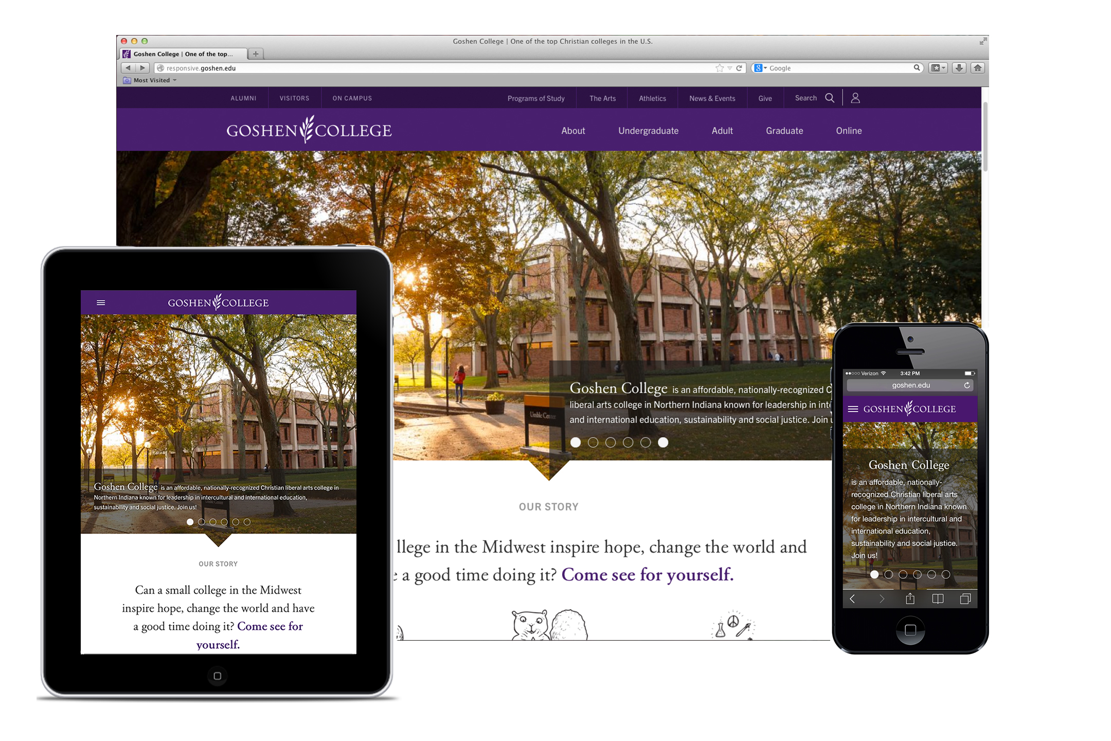
We love goshen.edu and we know you do too. The Communications and Marketing Office is excited to launch a redesign of goshen.edu, which will meet the needs of a growing number of visitors* who are navigating goshen.edu on a mobile (or tablet) device. This was the driving factor for redesigning the website; the old site just wasn’t cutting it anymore! Our goal was to create a site that meets user needs in any medium. This approach to website design is called “responsive” design, and gives users access to the same content, displayed in the best way possible, on any device.
At this point (Sept. 29, 2014), we are launching the first phase of the redesign, with the homepage, the adult and graduate sites, as well as new sites for every program of study in the responsive template. The project is still a work in progress (as most websites are at all times), but we are far enough along to feel confident about launching now, as it brings many improvements over our prior site. Over the coming weeks and months, more and more of the website will be migrated into the new template (this also means that there are areas of the site which won’t have the new look right away).
Redesign features
1. Responsive design
As stated above, the primary goal for Goshen’s website redesign is to build a site that serves college content to audiences on any device. This content, whether text, images, links or videos, is designed using site-wide “responsive” technology to be easily readable/viewable on a desktop computer, tablet, phone or even a large-screen television.
You can use one of these methods to see responsive design in action:
- Open the website on your smartphone and/or tablet and compare the functionality of these views.
- From your desktop, open the website and resize your browser window to “medium” and “small” sizes to emulate how the content and design shifts on a tablet or smartphone screen.
2. Navigation
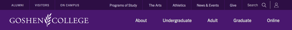
A new purple bar at the top of goshen.edu will help visitors navigate to high traffic pages and Web resources (the former navigation had navigation that ran down the left side of pages and across the top). The bar will also “stick” to the top of the page as you scroll down any page.
The new navigation includes three sections:
- Main categories of About, Undergraduate, Adult, Graduate, Online, which each have drop-down menus. These are geared primarily to our different prospective student audiences, helping get them quickly to which ever section of the website that they are interested in.
- Audiences (top left): these drop-down menus give quick links for Alumni, Visitors and On Campus people (students and employees).
- Quick links (top right): offer easy access to drop-down menus for Programs of Study (a searchable list), The Arts, Athletics, News & Events, Give, and Search (either the website or our people directory).
3. Telling the story
As we were redesigning goshen.edu, we wanted to give visitors a quick taste of the distinctiveness of this place academically and as a vibrant community. We have tried to do that with both our design and content choices.
Design
Designed by Hannah Gerig Meyer ’08, the new site is a little cleaner and more open than the old site, while there are still large images that visitors will gravitate towards. With font choices, more white space and the incorporation of more purple (our school color), we hope that the new site captures the essence of the academic quality of GC.
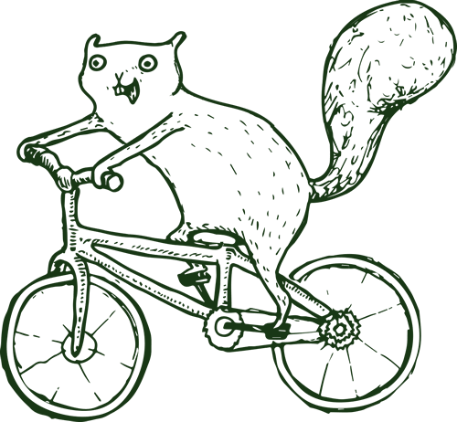 In addition, you might notice the presence of squirrels (drawn by Emma Gerigscott ’14)! They were incorporated to add a bit of whimsy, speaking to both the fact that visitors immediately notice the abundance of squirrels running around campus, as well as the humor and joy that permeate campus life.
Content
As we made decisions about the content we wanted to incorporate in the redesign, it became an opportunity to tell the GC story better and to showcase both our high quality academic programs, amazing outcomes and the vibrant campus community. We chose to move in the new direction of a site that would involve a fair amount of scrolling (a common current trend in web design and a natural practice for today’s web users) for those interested in learning more, giving room to display such compelling content as our distinctives, profiles of students/alumni/faculty, outcomes statistics, videos, photo albums of recent campus events and an Instagram feed. As you scroll down the page, a button will pop up in bottom right hand corner that you can click to take you back to the top at any time.
We are also excited to launch new websites for every program of study (majors and minors) with this redesign. Formerly, programs of study were housed within academic department websites, but we are moving away from that structure since it isn’t how a prospective student is looking for the program of study they are interested in. On every program of study site, we have also included inquiry forms so that it will be simple for prospective students to get engaged with us.
How to request web changes or report errors
We need your help to make goshen.edu the best that it can be! Goshen.edu has undergone numerous redesigns over the years (for a peek, check out the site through The Wayback Machine!). We believe we have created an improved website, but also know that it isn’t perfect. As you have suggestions, want to request changes or have an error to report, please click on “Website Feedback” in the footer to fill out a short form. This will come to us in the Communications and Marketing Office and we will address issues as best and as quickly as we are able to. You can also email com-mar@goshen.edu at any time if you have a question about goshen.edu.
Welcome to the new Goshen.edu!
— Goshen College Communications and Marketing Office (com-mar@goshen.edu)
* In the past year, almost 21% of visitors to goshen.edu arrived on a mobile device (including tablets), which compares to almost 13% in the prior year. As well, a recent national survey of 1,000 college-bound seniors and more than 500 parents revealed that 9 out of 10 seniors and 8 out of 10 parents have access to a mobile device; 71 percent of seniors and 45 percent of parents have looked at college websites on their mobile devices.