


Goals for our use of typography include:
Compared to print, computer displays currently have a very low resolution:
The designer has no absolute control of type size, because people can easily change it...e.g. in Firefox hit ctrl-+ (on the numeric keypad) to increase font size..In IE try "View | Text zoom>"
Our perception of words involves, initially, a perception of word shapes. Lower case type is easier to read than upper case, since there is much more variation of shape along the tops of words. See this excellent example on the Yale/AIM typography page.
Conversely, you may wish to use upper case selectively to slow down someone's reading.
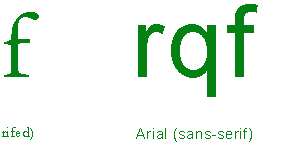
Serifs are those variations in stroke thickness and decorations at the end of some strokeswhich are not present in "modern" sans-serif typefaces.
|
|
|
|
||
Print typographers claim that type with serifs is easier to read than type without serifs. The serifs offer extra "clues" to your eye about which letter is being shown.
But at small sizes, on a low-resolution computer screen, serifs may no longer be so distinguishable, and so the legibility difference between serif and sans-serif fonts is less.
You specify a font with a style rule like this:
font-family: Papyrus, Georgia, Times New Roman, serif;
You specify several because visitors to your site will only see text set in a font installed on their computer. The 10 core fonts are the most commonly available.
![]() (instead of CSS) can be used in a limited way for more control,
but have their own disadvantages.
(instead of CSS) can be used in a limited way for more control,
but have their own disadvantages.
Microsoft employed designer Matthew Carter to come up with Verdana and Georgia specifically for increased legibility on computer screens. Arial is shown for comparison. Verdana has a greater relative x-height and the bold font looks bold
| Text set in 10px Verdana, Verdana bold. Can you tell 1, l, I apart? |
| Text set in 10px Arial, Arial bold. Can you tell 1, l, I apart? |
| Text set in 10px 'sans-serif', sans-serif bold. Can you tell 1, l, I apart? |
| Text set in 10px Georgia, Georgia bold. Can you tell 1, l, I apart? |
| Text set in 10px New Times Roman, New Times Roman bold. Can you tell 1, l, I apart? |
| Text set in 10px 'serif', serif bold. Can you tell 1, l, I apart? |
Typographer's units of measurement include....
...is the width of a column of text
Recommendations are to keep this in a range of about 45-75 characters (with spaces), which we might do like this...
#content { width: 30em; }
See Typographic: Legibility and spacing for definitions of these terms:
Tracking / letterspacing: letter-spacing -- Use more of it with all capital letters to increase legibility
Leading: line-height -- As you increase the number of characters per line (the 'measure'), you can increase leading for better legibility.
Example: A List Apart, NYTimes article.
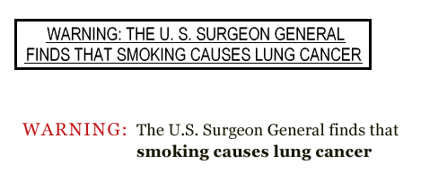
People tend to scan web pages rather than reading them word-for-word, so you should feel free to use typographic emphasis more freely than you would in print.
With rare exceptions (if any) do not underline text for emphasis, since on the web underlining usually communicates at some level "I'm a link".
But eventually, too much emphasis = no emphasis (or the "boy who cried wolf" syndrome). If your whole resume is in a bold typeface, nothing will stand out. Similarly, avoid large swaths of capitalized text or colored text. Overuse of emphasis is called shouting by Yale/AIM and others. Make link texts concise. In general, use typography to emphasize key ideas...only.
Canada, also finding that text warnings on cigarette packages were going unheeded has tried warnings containing graphic pictures.
 The
pixels on computer screens are laid out on a rectangular grid running vertically
and horizontally. If you look closely you'll find that HTML text is not anti-aliased
(unlike text that you put in an image with Photoshop). Therefore italics, which
involve strokes running off at arbitrary angles, are fairly jagged. So, italics
are less readable, and less suited (particularly smaller fonts) for extended
passages compared to print media. For text on the web, in general, you should
use bold instead of italics to emphasize text.
The
pixels on computer screens are laid out on a rectangular grid running vertically
and horizontally. If you look closely you'll find that HTML text is not anti-aliased
(unlike text that you put in an image with Photoshop). Therefore italics, which
involve strokes running off at arbitrary angles, are fairly jagged. So, italics
are less readable, and less suited (particularly smaller fonts) for extended
passages compared to print media. For text on the web, in general, you should
use bold instead of italics to emphasize text.
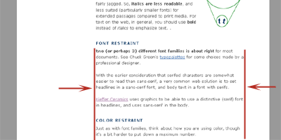
Two (or perhaps 3) different font families is about right for most documents. See Chuck Green's typepalettes for some choices made by a professional designer.
With the earlier consideration that serifed characters are somewhat easier to read than sans-serif, a very common web solution is to set headlines in a sans-serif font, and body text in a font with serifs.
Kieffer Ceramics uses graphics to be able to use a distinctive (serif) font at the top of the page, and uses sans-serif in the body.
Just as with font families, think about how you are
using color,
though it's a bit harder to put down a maximum number.

The author of this essay on designing with color for the visually impaired points out that blues/purples/reds on a light or white background produce the highest contrast. Also, different cultures perceive colors differently.
As with all web design be consistent.
Establish patterns and then break them only for a reason