Graphic Design
There are whole courses on (and careers in) graphic design. It is best learned by practice. Our more limited objective here is to at least introduce a common vocabulary in order to...
- increase what you see
- increase the options you give yourself as you compose
- talk about what seems to you to work well, or not.
Readings
 General design considerations, Visual hierarchy
Visual communication
- depends on perception
- of many variables
- to create something with integrity
Perception is learned.
- it is different for people with different experience
- it changes with further experience (learning)
It is not something you are any longer beginning to learn to do, but hopefully
it is something we are all learning to do better.
Visual communication is a combination of form and context
Form includes:
- value
- color
- line
- shape
- texture
- space
In design type is a somewhat unique combination of form and context
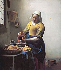
Value
Akin to what we discussed in color theory as 'brightness'.
Some designers will work in grayscale until the last stages of the project
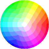
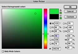
Color
Using the Hue / Saturation / Brightness system....
Here are two pages (sixsides.com, courtesy of the Wayback Machine from
2000)... Why do they look like they're from the same site, even though the
colors used on the two pages are different?


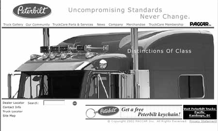
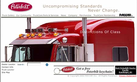
Use intense color with a reason. Here intense color is used to control emphasis

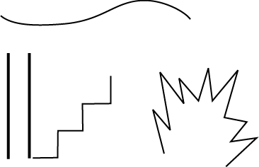
Line
Line direction
- horizontal tends to be calm
- vertical tends to be strong
- diagonal tends to be dynamic
Line movement
Shape and Space
Tufte quotes Josef Albers (Envisioning Information - Layering
and Separation) on "1 + 1 = 3" effects
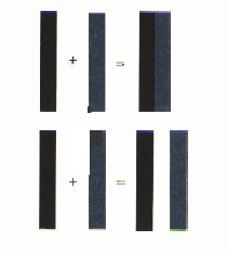
The point is that you should think not only about the shapes of the elements
in your design, but also the leftover or negative space between the
shapes the you've assembled. The 'FedEx' logo shows an elegant way of taking
advantage of the negative space between shapes to add an extra, and in this
case complementary, visual element:

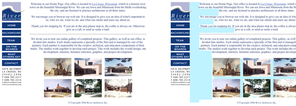
The whitespace on the River
Architects home page looks somewhat haphazard in width, with many different
shapes...
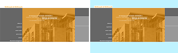
The whitespace on the McKissack
& McKissack homepage can be thought of as just 2 or 3 shapes. And these have
widths that relate to each other.
Type
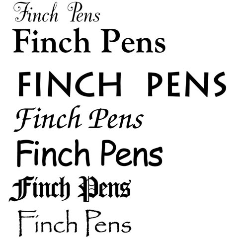
Different typefaces have
- different formal qualities and
- different associations
You can let your audience, or rather the associations (context) your audience has, help determine your design decisions.
Context
Visual communication is a combination of form and context.
Context is the connections the viewer makes, what you recognize,
. . .

Principles of organization
- Structure
- Emphasis & Proportion
- Unity & Variety
- Balance
Structure
the visual skeleton of the composition
guides the viewer's eye
Clarity is important
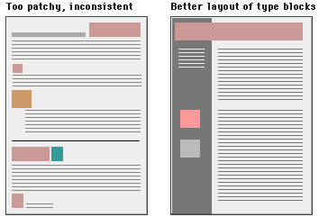
Structure depends on the nature of the information you want to communicate
- How much information do you want on each page
- How transparent should it be
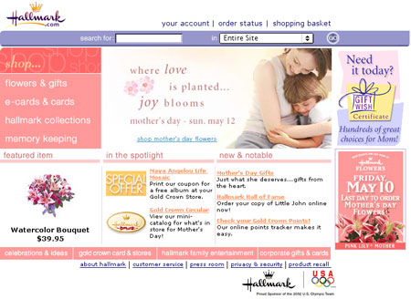
Yahoo.com, Bloomcosmetics.com,
The strongest impact comes in the viewer's first look
A monitor set at 800x600 will have a maximum reliable viewing area of 760 x 410 pixels
Keep the most important information 'above the fold'
If the information will be printed to be read the maximum width should be 560 pixels, or better yet, around 30 ems.
Emphasis & Proportion
Emphasis depends on:
- contrast
- size
- color intensity
- isolation
Proportion is a comparing of sizes
- strong influence on emphasis
- can create a sense of space
Unity and Variety
Unity is created by grouping or by repetition of something
Tufte claims that setting similar elements side by side invites a comparison of how they differ.
Unity is a consideration within a page and also across the pages of a site.
Balance
- is like a teeter-totter
- consider different elements, like color, value, . . .
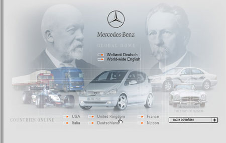
How do **Mercedes Benz** and **Jeep** communicate different messages?
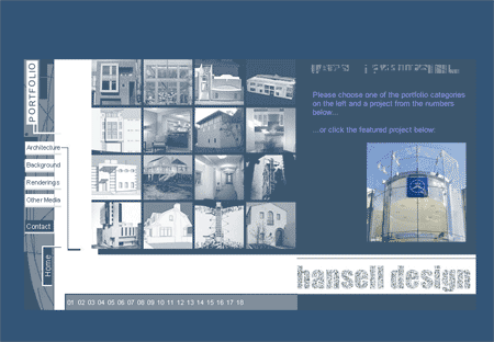
Page critiques
taxwizard.com, americanmidway.com
walrusgear.com
Additional Resources
CommArts: design interact
Design Reference: The Webby Awards http://www.webbyawards.com/
Digital Design Manual: vectoralia.com
Web Color Generator: http://wellstyled.com/tools/colorscheme2/index-en.html
Web Page Design for Designers: http://www.wpdfd.com/wpdres.htm
Web Design Tips and Tricks: http://www.tips-tricks.com/