We'll experiment on this test page. The WD toolbar lets you see the effect of changing the styles on any page on the web -- CSS | Edit CSS
Many HTML elements, for example, p, ul, li, body, h2 can be thought of as having a bounding box around them. There are CSS rules that allow you to control margins, borders, and padding around any single element, as well as alignment (float) relative to other elements.
For
example, this paragraph begins with a tag that reads:
<p style="padding:20px; background-color: #def;">For example...
You probably also noticed that this is a new way to apply styles to just one tag--with the style attribute. This is a fine thing to do for a one-off style, or while you're experimenting with styles. But if you're trying to get several different things all looking the same, you're better off setting a style rule on a particular tag, or creating a CSS class.
You can set the padding on just one side of the box with one of these style rules:
padding-top: 2em;
padding-left:20px;
padding-bottom:2em;
padding-right:30px;
Or set the same padding on all sides with
padding: 2em;
Similarly, with margins, you set margins individually with margin-left:... or all margins simultaneously with margin:...
One side at a time and one characteristic at a time...
border-top-width: 2px;
border-left-color: #660099;
border-bottom-style: dotted;
Or all four sides, one characteristic at a time...
border-style: dashed;
Or all together now...
border: 2px solid red;
<p style="text-align: center">
will cause the contents inside the box (text and graphics...) to be centered. Options include left, right, center, justify
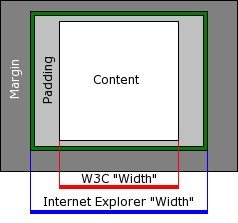
The W3C defines the width of an element as the width of its content. Padding and margins are added on after this. So, the following CSS style rules:
#testbox{
  background-color: yellow;
  width: 100px;
  padding: 100px;
  margin-bottom: 100px;
  border: 50px solid #bbbbbb;
}
Results in a box like this, where...
So the actual outside width of the bordered area is 400 pixels (= 100 + 2*100+2*50):
Internet Explorer 5 originally had a different way of interpreting width. See wikipedia on the Internet Explorer box bug for more info.
The problem is that IE 6 and IE 7 maintain this old interpretation of the width in 'quirks mode' which can be triggered by not having a doctype declaration.
If you're designing a new web page, the solution to this is to force IE browsers to display in W3C 'standards mode' by using one of the strict doctypes:
<!DOCTYPE HTML PUBLIC "-//W3C//DTD HTML 4.01//EN"
"http://www.w3.org/TR/html4/strict.dtd">
With this declaration, you can be assured that all modern browsers, as well as IE 6 and 7 will all calculate widths the same way.
If you've set margins, you may not need (or perhaps even better not...) set widths and heights.
Conversely, if you set height and width, it may be appropriate to set margin: auto.
What if you want to throw a bunch of things together (as it were, into a larger box), and push them around as a group? Then you need: