-----------------------------------------------------------------------------
Everybody
immediately
responds to subject matter in art.
A picture of a
butterfly
and a picture of a snake do
not
get the same response.
In addition
to subject
matter*, the formal aspects of visual composition are like the
grammar
of a language. In writing, a story is written with words - subject
matter.
Like good literature and good poetry is more than words and subject
matter,
art is more than pictures. The organization, the sentence structure,
the
style, and so on can make or break a good story. In art, the way the
formal
elements are arranged can make or break a good picture idea.
The use of design
principles applied to the visual elements is like visual
grammar.
When children learn art, it is like learning to read and write the
language
of vision. When they develop a style of expressing visual ideas, it
helps
them become visual poets. Looking for the visual effects of
design
principles does not have to limit an artist's options. It can focus an artist's
experimentation and
choice
making.
TEACHING
TIP
Art vocabulary can be taught along
with
every project. Children can understand terms if the teacher explains
them
and posts them with illustrations. Including new art words in the
weekly
spelling list is a good way to integrate and reinforce new terms.
*Glossary: "Subject matter" is similar to "topic" or "content"
when teaching art. "Content" may also include interpretations that go
beyond
the obvious subject matter used by the artist. Content generally
includes
"symbolic" meanings implied by the
work.
top of page
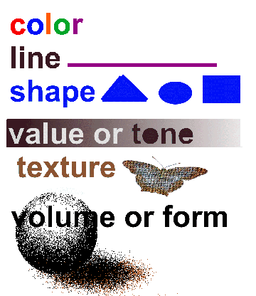
Six Visual
Elements (art elements)
 top of page
We think of the elements
as the basic visual material with which to make art. Is hard to imagine
anything visual without the use of one or more of these elements.
We think of the principles
as ways to work with and arrange the elements.
Some Design
Principles
or design
rules (some
creative artists purposely break rules) top
of page
This list
is an
example list.
Every
author seems
to have a slightly different list of Principles.
- Emphasis - say "Center of Interest." It is about dominance and
influence.
Most
artists put it a bit off center and balance it with some minor themes
to
maintain our interest. Some artists avoid emphasis on purpose. They
want
all parts of the work to be equally interesting.
- Harmony - As in music, complementary layers and/or effects can be joined to produce a more attractive whole. The composition is complex, but everything appears to fit with everything else. The whole is better than the sum of its parts.
- Unity - When nothing distracts from the whole, you have unity. Unity
without
variation
can be uninteresting - like driving on a clear day through Western
Kansas on the interstate.
Unity with diversity generally has more to offer in both art and in
life. Of course some very minimal art can be very calming and at
times even very evocative. Even a simple landscape can have a powerful effect.
- Opposition - uses contrasting visual concepts. That same Western Kansas
"big sky" landscape becomes very dramatic and expressive when a storm
builds in the
southwest. Principles can grow out of any artistic device that is used to produce an effect on the viewer.
TEACHING
TIP
Children as young as two or three
can
differentiate differences between rough and smooth, hard and soft,
various
colors, dark and light, big and little, and other opposites. Sorting
and
identification activities help them learn to focus on learning tasks.
If students do some hands-on practice they learn these ideas better than when they asked to observe something shown by a teacher.
Students can be based to do curved and straight, dark and
light
(low key - high key), open and closed (in the frame and extending beyond), positive and negative (subject and background), soft and
hard, smooth and rough, parallel and branching, spiral and concentric,
and so on. After each practice routine, students stop a moment and tell each other how the vocabulary words are being shown.
Balance is
the consideration of visual weight and importance. It is a way to
compare
the right and left side of a
composition.
top of page
© marvin
bartel
Asymmetrical
balance is
more interesting. Above both sides are similar in visual weight but not
mirrored.
It is more casual, dynamic, and relaxed feeling so it is often called
informal balance.
Radial balance is
not very common
in artist's compositions, but it is like a daisy or sunflower with
everything
arranged around a center. Rose windows of cathedrals use this design
system.
 Of course a sunflower can have
many meanings
and feelings beyond its "radiant" feeling. Farmers might hate it as
weed
cutting into their corn production. On the other hand, many of us can't
help thinking about Vincent Van Gogh's extraordinarily textured painted
sunflowers. Once we have contemplated those thickly expressed colors
and
textures with their luscious painterly surface, every sunflower we see
becomes an aesthetic experience filled with spiritual sensations.
Of course a sunflower can have
many meanings
and feelings beyond its "radiant" feeling. Farmers might hate it as
weed
cutting into their corn production. On the other hand, many of us can't
help thinking about Vincent Van Gogh's extraordinarily textured painted
sunflowers. Once we have contemplated those thickly expressed colors
and
textures with their luscious painterly surface, every sunflower we see
becomes an aesthetic experience filled with spiritual sensations. |
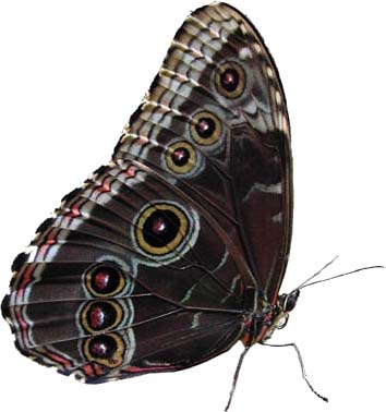
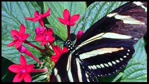
The butterfly
below by
itself is essentially symmetrical.
Both sides are
similar in visual weight and almost mirrored. Because symmetrical
balance
often looks more stiff and formal, sometimes it is called formal
balance.

Of course a
butterfly, even though
it is symmetrical, doesn't look stiff and formal because we think of
fluttering
butterflies as metaphors for freedom and spontaneity. It is a case of
subject
matter and symbolism overpowering formal design effects.

This is a simple diagram of radial
balance.
|
- Variety
- You create
variety when elements are changed. Repeating a similar shape but
changing
the size can give variety and unity at the same time. Keeping the same
size, but changing the color can also give variety and unity at the
same
time. In visual composition, there are many ways you can change
something
while simultaneously keeping it the same.
- Depth
-
effects
of depth, space, projection toward the viewer add interest. Linear
perspective
in the real world makes things look smaller in the distance. Some
artists
try to avoid depth by making large things duller and small things
brighter,
and so on, to make the objects contradict realism. Many artists don't
believe
in realism even though they could do it if they wanted to. It seems too
boring to them. Realism wouldn't be art for some artists.
- Repetition
- Some
ways to use Repetition of the Visual Elements are:
- Size
Variation can apply to shape, form, etc.
Notice
how size can effect how close or far something can appear to be from
the
viewer. top
of page

|
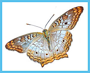
Here
the same butterfly is shown twice. Which one appears closer? Note
how size
relationships create depth or space in a composition. Children in first
grade can already recognize closer and farther based on size even
though
they wouldn't typically use this in their pictures unless they were
motivated
to do so. |
|
- Repetition
can
be used on all of the Visual Elements. If things are repeated without
any
change they can quickly get boring. However, repetition with variation
can be both interesting and comfortably familiar. Repetition gives
motion.
- Variation
can be
used with all of the visual elements. See "Variety" above. You can do
this
with all the elements. Artists do this all the time.
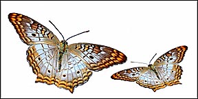
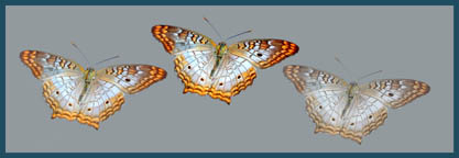
| Color saturation,
sometimes called "color intensity" or brightness can also give a
feeling of depth and space. Which of these
butterflies
are farther away? Most second graders can see this effect when they are
asked to look for it. These butterflies create the illusion of depth
even
though they are all the same size. |
 © marvin
bartel
© marvin
bartel TEACHING
TIP
By the third grade, most
children can
reproduce effects like this that they observe in nature if the teacher
has them observe these effects in the landscape. A foggy morning is an
excellent time for a lesson in "atmospheric perspective". Atmospheric
perspective
causes colors and shapes to get blurrier and foggier in the
distance. |
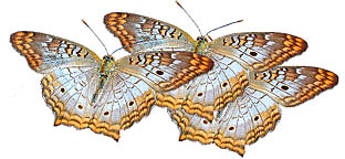
Overlapping
is often used by artists to create depth. Young children try to avoid
overlapping
in their work.
TEACHING
TIP By first grade if asked, most can explain
how overlapping makes some things look closer and other things farther
away. |

© marvin
bartel |
Visual
Effects
When
we
analyze artwork
we often start with visual effects. We notice something happening. Then
we try to figure out why it
happens.
top of page
- Motion.
Motion
isn't a principle. It is one those magic effects when a still picture
has
motion. There are lots of ways to get motion.
MOTION
EXAMPLES
Sometimes it has to do
with orientation.
- A diagonal line is
more
dynamic than
a horizontal or vertical line.
Sometimes motion depends on
the character
of the element itself.
- A straight line may
be
less dynamic
than a zigzag or a curving line.
- A blended area may appear to flow.
Depth. Depth
is another magic effect. Illusion and magic are two threads of the same
cloth.
DEPTH
EXAMPLES
Sometimes the illusion of
depth
has to do with orientation.
- If you want a chair
or
person to appear
further away, you can place them higher on the picture plane.
Sometimes the illusion of
depth depends
on the character of the element itself.
- A warm color can appear to project and cool color can
appear to recede,
other things being equal.
- A light tone (value) can appear to project and dark tone
can appear to
recede. top
of
page
Teaching Creative Thinking Habits with this page
HOW CAN TEACHERS GET CREATIVE TEACHING IDEAS?
Andy Goldsworthy, makes artwork based on Six Elements of Visual Art. To avoid blocking individual innovative and thinking, what if we show Goldsworthy's work and discuss it AFTER students have done their own creative work? Creative teachers study the work of great artists, inventors, scientists, and so on. These teachers "reverse engineer" the ideas, creative process, and basic questions the creative experts probably used.
Instead of showing preliminary examples from artists, I often start students with prescribed media practice (warm-ups), ways to experiment (discover what works), ways to generate their own original ideas. The sequence is described in How to Plan Studio Art Lessons to foster artistic thinking and creativity - starting studio lessons without showing examples and teaching art world connections at the end of the lesson. If students are stuck, I ask them open questions to jog their thinking, or ask them to try some experiments to see what works best. Many artists and inventors do many preliminary drawings. They have learned that when they start to draw they will see many new ideas suggested.
BOOKS:
Bartel, M. "The art of motivation and critique in self-directed learning." This is Chapter 13, pp. 131- 142, in an anthology of choice-based art education contributions edited by Jaquith, Diane B. and Hathaway, Nan E. The Learner-Directed classroom. © 2012, Teacher College Press.
Hetland, Lois. et.al. Studio Thinking: the real benefits of visual arts education. 2007, Teachers College Press.
Jaquith, Diane B. and Hathaway, Nan E. The Learner-Directed classroom. 2012, Teacher College Press
Simpson, J.W. et.al. Creating Meaning Through Art
. 1998, Prentice Hall, pp. 87-88, 113.
If you liked this page, you may also like one of these.
ETHICAL AESTHETIC QUESTIONS for the DESIGNER
or
Aesthetics and Ethics in Everyday Life (these are two versions of a similar essay)
Percy
Principles of Composition - - my personal list of
principles - as an artist - - what are yours?
Common Classroom Creativity Killers - what we do
everyday that discourages creativity
BACK to Learning to Think & Feel Artistically contents & LINKS page
This is an offsite SLIDESHARE link to some slide presentations on Elements and Principles. After loading, click the bottom right corner for the full-screen presentation mode. If the link is broken, try a search for "kpikuet elements and principles"
All rights reserved. Contact the author for permission to reproduce or publish.
Photos, layout, and text © Marvin Bartel 1999, 2000 - author bio
Updated February 27, 2012.
Goshen College Art Department 
Drawing to Learn DRAWING
an ebook by Marvin Bartel - 2010
http://www.bartelart.com/arted/book/Drawingbookorder.html
This is a book written for kids who can read who want some good ways to practice their drawing skills. Us older folks who still want to learn new stuff can also use this book. It is also great for artists who want some ideas on how to help children learn to draw better. If you are an artist, you could start a Drawing Camp or some after school art classes using the ideas in this book. Parents can use this book to plan a really cool and creative kids' party. Art teachers will find new ideas and inventions not published by others. It is not a book of formulas or steps to draw certain things. It shows specific ways to see, notice, and practice drawing based what you see and/or feel in order to draw to document and/or express your observations and feelings.
It is an online .pdf downloadable book. You can read it on any computer or print it.
See the order page for more information, a
Table of Contents, and price for this book
|
|
 top of page